Rebranding - Azlogistika Management and Services
Azlogistika is a local company that has been operating since 2009 in Baku. The company provides transport and logistics services. The company's services include transportation of dangerous goods, oil products, sewage and industrial water, heavy goods, international transportation, etc. includes. Azlogistika is one of the country's leading logistics companies and was selected as the best logistics company in Azerbaijan in 2015 and was awarded many ISO certificates. It plays a key role in meeting logistics needs such as transportation, relocation, multimodal operations, heavy equipment logistics
- I created this project to enrich my portfolio and has nothing to do with the Azlogistika Management Services. However, I am now offering this branding for sale to individuals in the logistics industry who are interested.


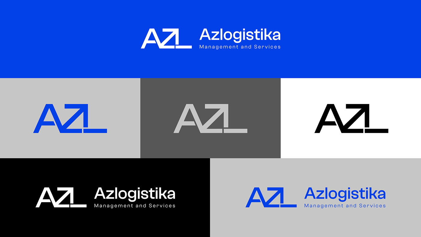
The logo includes the letters A, Z, L and an arrow symbol. The arrow symbol means precision, concreteness and directs attention first to itself and then to the direction it points. With this, the company sends a message to its customers that it is accurate in its work, that it should be trusted and followed. The sign of the arrow also reflects the meaning of progress, development, direction and represents a set of values and services such as reliability, speed, accuracy and professionalism.


Have used 5 colors. Blue and gray tones are taken as the main color. Blue represents professionalism, confidence and gray tones represents seriousness.